“GigGo” - A digital solution for digital nomads.
Digital nomads face complex and unpredictable work conditions that challenge their ability to find consistent, trustworthy, and relevant job opportunities, the job search process often requires the use of multiple platforms and often exposing them to irrelevant or uncertain job offers.
The lack of visibility into project terms and payment processes further limits trust. They want more agility through maintaining flexibility but make decisions with control and intention. They need tools that provide clarity, efficiency, engagement and structure when searching for jobs, and navigating legal, professional, financial and logistical issues.
Without support that balances freedom with control, many struggle to sustain a consistent and secure work-life rhythm.

Preparations & Research
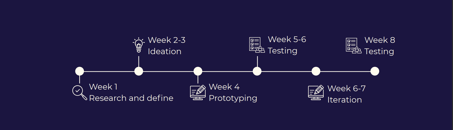
Before conducting research, we had to do some planning to kick-off.
Starting with a project plan scope including 7 weeks of research and defining, ideation, wireframes, prototyping, testing and iterations.
Research goals & methods
What challenges do digital nomads face when searching for work?
Where do freelance workers prefer to work from?
What motivates them in their job search process?
What features do they look for in a job platform or marketplace?
How do digital nomads typically discover new job opportunities or clients?
Research goals:
Research methods:
Literary reviews.
Interviews.
SWOT analysis.

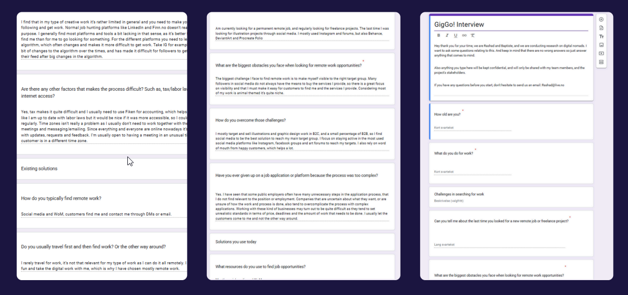
Interviews
After we finished defining our problem statement, research goals and methods.
I started screening participants and ended up with four individuals who we thought would be the perfect match as of having relevant background for conducting our research and user testing.
Sadly no one was ok with being recorded, so we had to find a better solution that would work for both us and the subjects.
So i landed on using Google Forms with all relevant question, and do a survey-kind of interviews. In the same form, you will find our interview script and the questions asked.
Data Collection / Spreadsheet
Moving on to our spreadsheet which we use to organize, analyze, and find patterns in user feedback.
This helps them make informed design decisions based on real user needs and behaviors.
Turning raw user feedback into clear insights, helps us create solutions that truly solve user problems and improve the overall experience.

SWOT Analysis
Now we move over to SWOT Analysis. Personally, this is one of my favorite things to do. Here i went on to analyse existing solutions. Looking for strengths, weaknesses, opportunities and threats.
SWOT Analysis will help me understand industry standards, identify gaps in competitors’ products, and discover opportunities to create a better user experience.
My victims for the SWOT Analysis will be Upwork, Fiverr and Freelancer.com.
Here’s what i found out:
Upworks
Large user base - 18 million registered in 2024.
Diverse categories(design, writing, development, etc.)
Built-in tools for contracts, time tracking, communication, and payments.
Fully optimized for global remote work
Strengths:
Challenging for new freelancers, due to oversaturation in certain categories.
Charges freelancers a discouraging service fee variable up to 15%.
Varying client quality. All clients are not vetted.
Weaknesses:
Opportunities:
Demand for freelance and remote workers is increasing globally.
Potential to offer more niche services or platforms for specific industries or skill levels.
Improve freelancer support through educational resources and community engagement.
Concerns over high fees, support quality, and job filtering may push users to competitors.
Labor laws in different countries could affect the platform.
Fraud, spam, or mismatches between clients and freelancers could damage brand trust.
Threats:
Fiverr
Easy for clients to browse and purchase services with a simple UI.
Fast onboarding, where freelancers can offer services immediately.
Active in over 160 countries.
Strong brand identity known for cheap services and quick delivery.
Strengths:
Seen as a budget option, which might undermine quality.
Costly fees. Fiverr takes a 20% cut regardless of gig size.
Clients with long term or complex needs, might struggle with limited customization in gigs.
Quality control can be an issue due to open access.
Weaknesses:
Theres room to attract clients with bigger and more comlex needs.
Adding project management tools, deeper analytics, or recurring gig options.
Improve quality through vetting or verifying freelancers.
Opportunities:
Threats:
High fees could push top performers to other platforms.
Quality and trust issues could discourage clients from returning.
High number of low-cost providers makes it hard for skilled freelancers to compete.
Freelancer.com
Covers everything from tech and design to engineering, writing, and data entry.
81 million users from 247 countries, regions, and territories.
Unique functionality where clients can post contests to get submissions from multiple freelancers and choose the best.
Encourages trust, and secure payments through milestone payment system.
Strengths:
Large amount of users leads to price undercutting and low-paying gigs, especially in crowded categories.
Less intuitive than competitive platforms.
Freelancer takes a 10% fee on fixed-price projects, but a lot of other fees and pricing can be confusing/off-putting. E.g memebership, contest fees, withdrawals.
Platform has had issues with low-quality or fraud jobs.
Weaknesses:
Adding more quality assurance and screening mechanisms to increase job quality.
Offering mentorship, onboarding help, and more robust project management features.
Improving UI to make it more intuitive to search for new opportunities.
Changing pricing and fees to be more straight forward.
Opportunities:
High fees could push top performers to other platforms.
Quality and trust issues could discourage clients from returning.
High number of low-cost providers makes it hard for skilled freelancers to compete.
Threats:
Affinity Mapping
So how do we synthesize and make sense of the data collected so far?

I hosted an affinity mapping session to organise complex data, identify patterns and themes as well as informing design descisions and recommendations.
Agility
Engagement
Optimization
Structure
Key Themes:
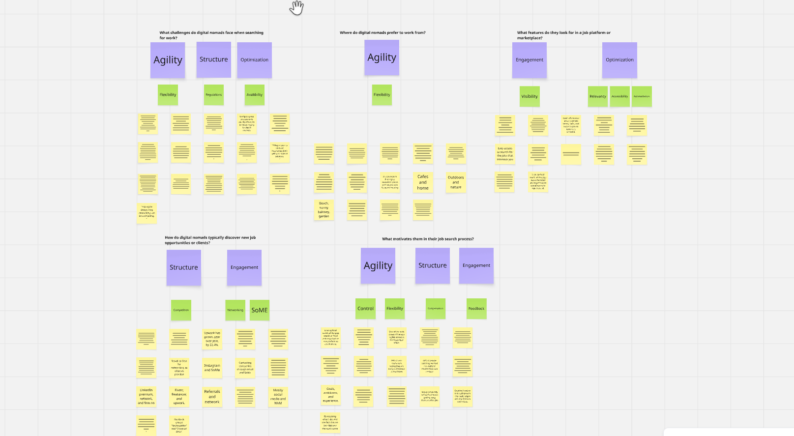
Insights and Recommendations
-
Digital nomads struggle with unpredictable work conditions, such as unstable internet access to legal/visa requirements, and financial solutions. Resulting in a need for flexibility. A big motivator for digital nomads is the sense of control they have in their work. They need tools that will allow them to have flexibility in what, where and when they work, without giving up the control they have of their own professional life.
-
Digital nomads are facing problems with finding good consistent work and building a good reputation. Some of the challenges they face here is due to the social isolation that comes with their lifestyle. Another important point for digital nomads is visibility, they have a need for clear information regarding project length, and payments. Therefore a focus on engagement is important here, to ensure they have the tools they need to build a good reputation, and find work that meets expectations.
-
Digital nomads will often find themselves overwhelmed when navigating, compensation, legal requirements and employer expectations. Providing digital nomads with clear systems, and easy to follow instructions/information will help them gain more structure and control when navigating these issues.
-
Many digital nomads use multiple different sources, and systems today. This results in struggles with inefficiencies in the job search process. Digital nomads need information and work opportunities relevant to their situation and expectations. It’s important for them to have information available, a big problem they are facing are shady job opportunities, so having relevant information available is is important moving forward, as well as making the searching process more efficient.
Ideation and Planning
Ideation and Planning

Collectively, we went on to defining the problem statement, User Personas, and User Scenarios. Which helped me come up with the following HMW questions:
How might we:
Support digital nomads in maintaining flexibility and control over their work?
Connect digital nomads to relevant, safe, and consistent job opportunities that match their needs and expectations?
Reduce the need for using multiple platforms by providing tools and information in a way that simplifies their job search and workflow?
Make legal, financial, and administrative processes easier to navigate, so digital nomads feel more confident and in control?
Help digital nomads build credibility and trust in a remote world by making their work, skills, and reputation more visible?
Top solution
We began with a focused brainstorming session guided by user-based "How Might We" questions to generate creative solutions for digital nomads.
This encouraged open-ended idea generation. We then used dot voting to prioritize the best concepts, balancing creative exploration with practical direction to develop grounded, actionable ideas.
Top Idea
The top solution is a mobile app that simplifies job searching, boosts visibility, and supports the daily needs of digital nomads.
It tackles key challenges like flexibility, structure, and workflow efficiency identified in our research.
Key Features:
Job filters for hours, length, and location
Regional knowledge base for legal and tax info
Verified clients to build trust
Suggested gigs for efficient job discovery
In-app chat to streamline communication
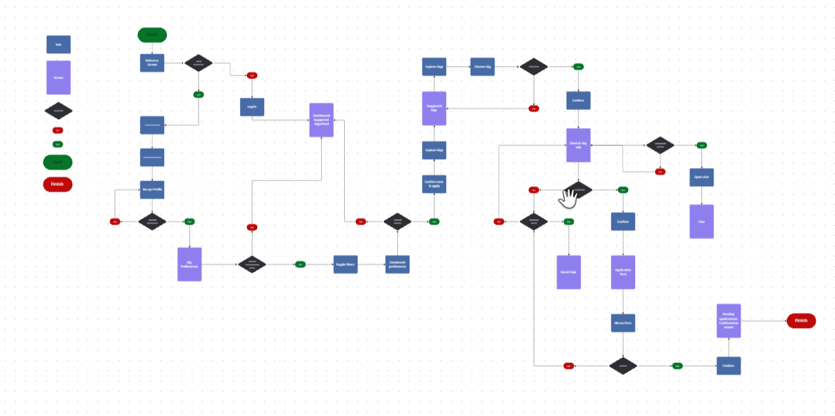
Flows and IA
After landing the top solution, i had to create User flow & Task flow as well as Information Architecture. Feel free to take a look!


Wireframes

Following steps after designing our wireframes was to run a test.
We decided to run a moderated in-person testing sessions to help us gain deeper, more nuanced insights into user interactions with the product.
This method offers several advantages over remote or unmoderated testing in this case.
Feedback Summary:
Users found the app intuitive and easy to use, with a familiar design that made it easy to learn. However, some confusion arose during testing due to non-interactive forms and an overwhelming dashboard.
Key Feedback Points:
Home screen should be a single list (Saved, Suggested, or Current Projects) with toggle options.
Hard to identify new gigs.
Too much information on the dashboard.
Saved and suggested gigs felt too similar, causing confusion.
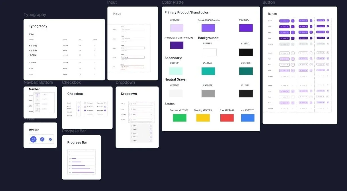
Design System
Preparing for the Hi-Fi prototype, i crafted an atomic design system, components such as buttons, and input fields were defined at the smallest level and then scaled consistently using spacing guides.
This modular approach allows the interface to adapt easily from mobile to desktop without breaking hierarchy or readability. Elements like job cards and filter chips reflow naturally
GigGo! Hi-Fi Prototype

Accessibility
Accessibility

Overall, the user testing validated our design as clean, modern, and intuitive. Participants easily navigated the interface, confirming strong visual hierarchy and clear content structure.
Feedback:
Icons in the bottom navigation bar were unclear.
Suggested adding labels to improve clarity and accessibility.
Recommendations:
Update bottom nav icons and add text labels to better communicate their functions and support accessibility.
Enhancing usability by applying strong visual hierarchy, clear contrast, and a consistent layout to support accessibility and ease of use.
Primary Enhancements:
Clear Headings: Titles like “Create Account” and “Welcome” stand out, making content easier to scan.
High-Contrast UI: Primary action buttons (purple on white) improve visibility and highlight key actions.
Consistent Layout: A unified grid system ensures predictable alignment, aiding navigation and cognitive accessibility.
Simplified Sign-Up Flow: Breaking the process into smaller steps (role, preferences, location, etc.) reduces cognitive load.
Use of Icons & Visual Cues: Icons in navigation, gig cards, and success screens aid visual recognition and support non-verbal users.
Recognizable Confirmation States: Success screens with checkmarks and “Welcome” messages offer clear, reassuring feedback—especially helpful for users with cognitive or attention challenges.
Compressed Information: Text-heavy content is now grouped into cards and sections, improving scanability and supporting accessibility for users with dyslexia or ADHD.